Design Showcase – Harbor and Wick Website UX/UI Project
Design Showcase
Harbor and Wick Website UX/UI Project
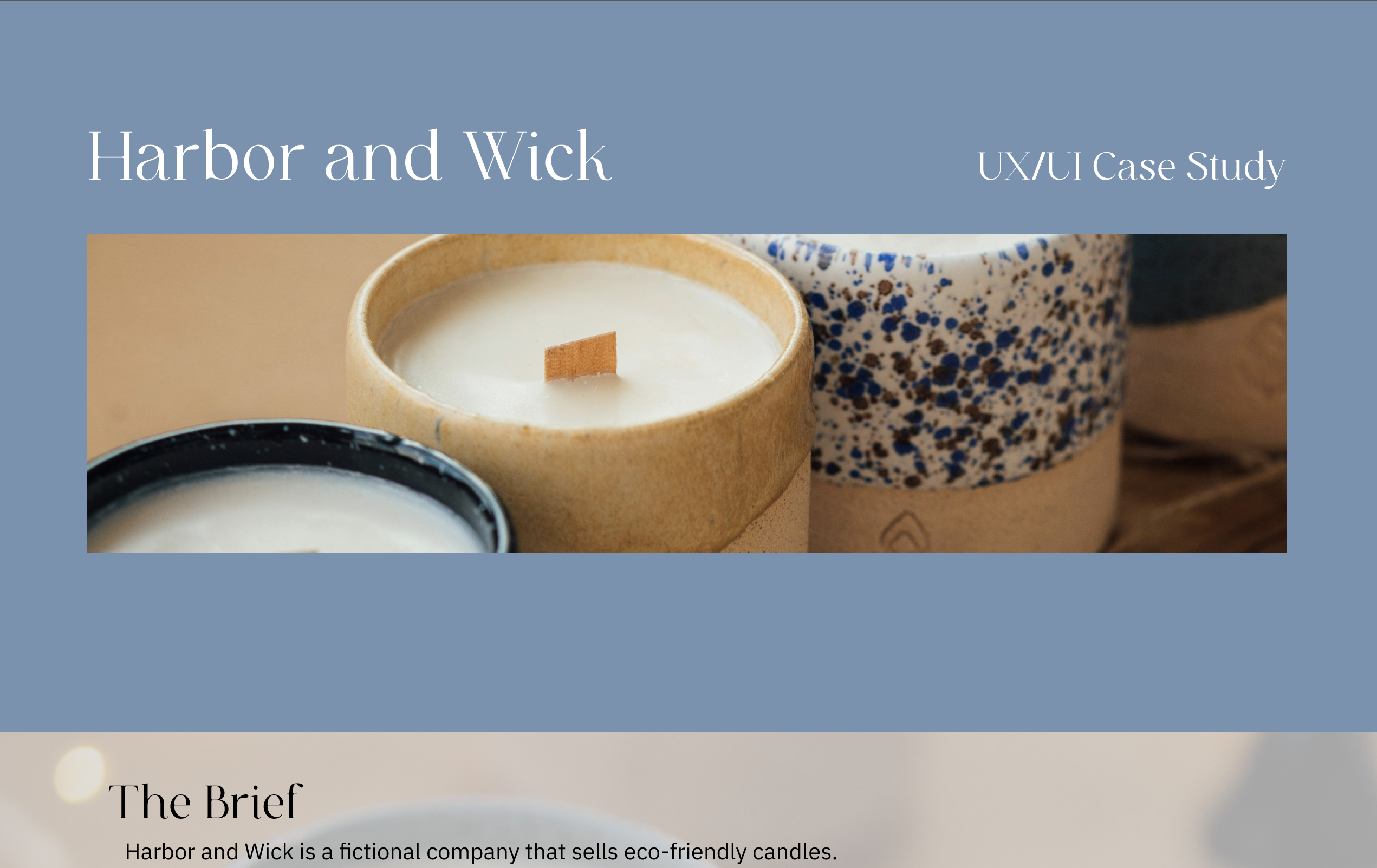
Concept website and app design for Harbor and Wick — a small candle company that uses natural and sustainable ingredients. This was created as part of a class assignment for UX/UI Design.
Project Scope
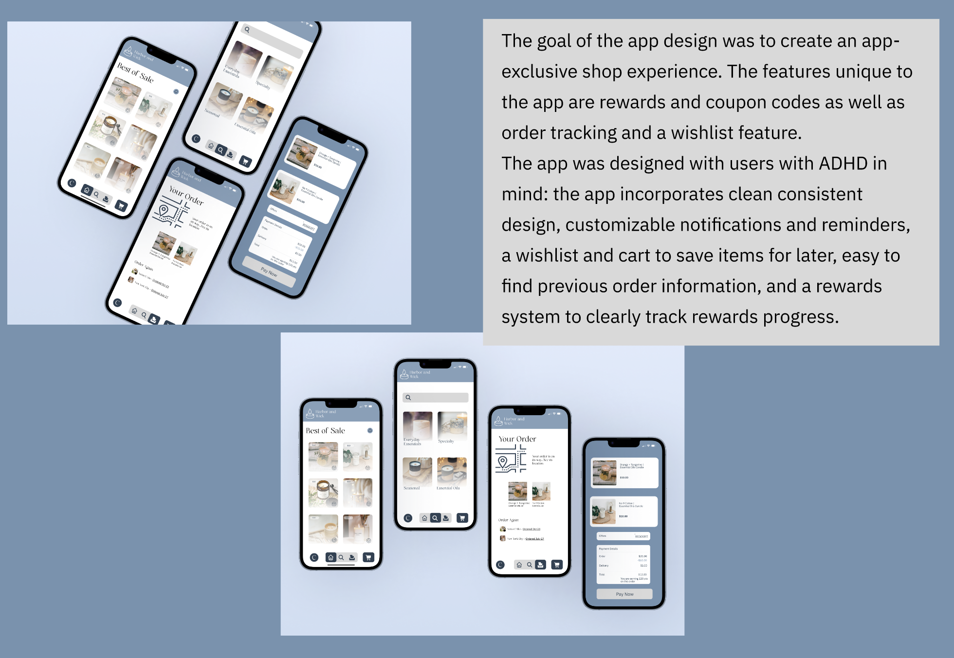
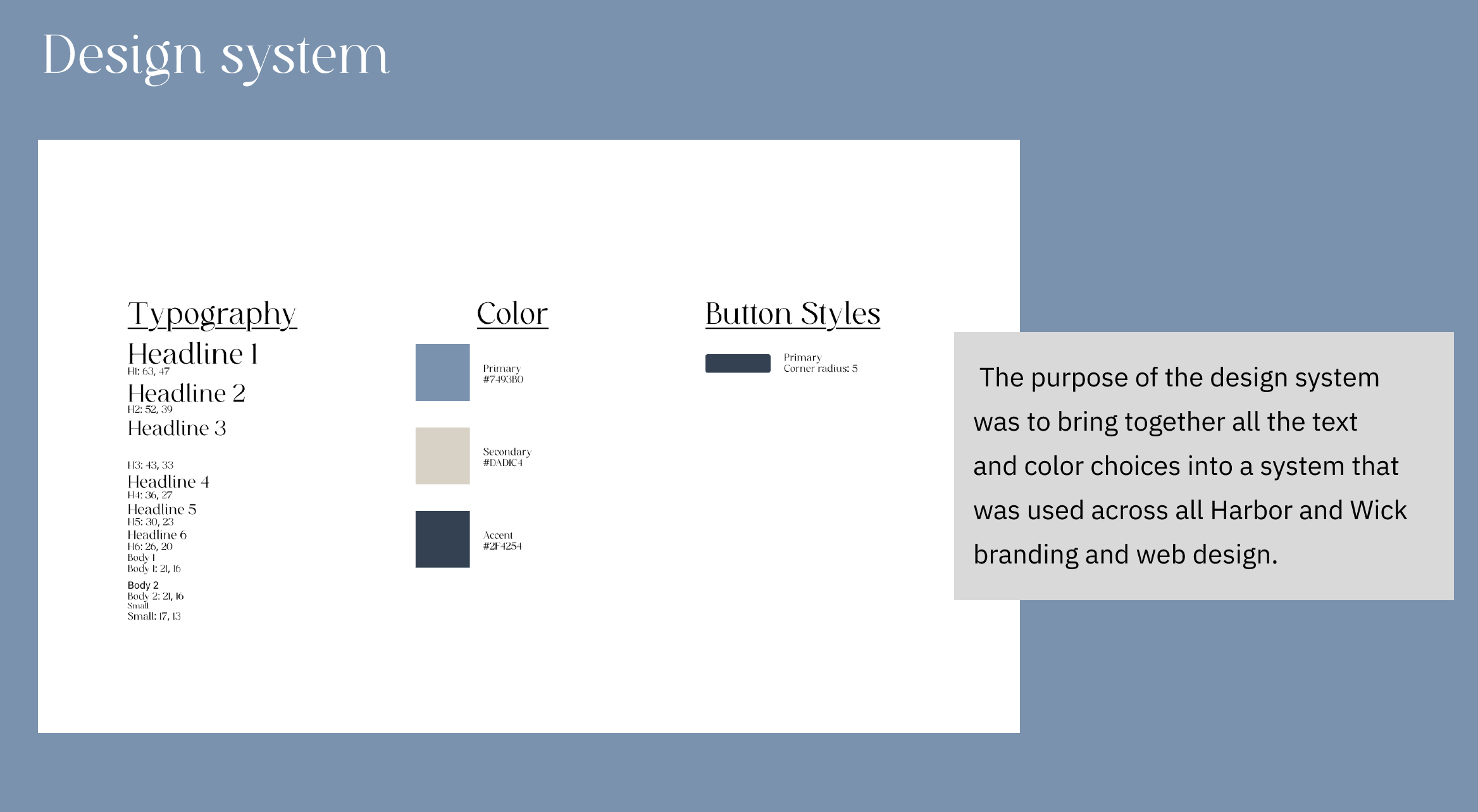
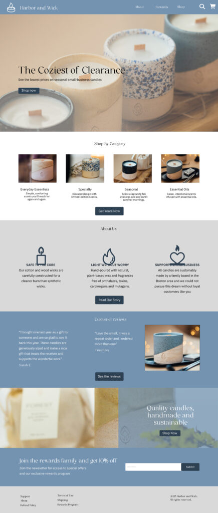
This project involved developing a website for Harbor and Wick, a conceptual candle company based in Boston. The scope included designing a full website wireframe in Figma and a hosted homepage in wordpress, alongside user testing and an app concept. The design choices communicated peace and elegance through color palette and typography.
Scope
Website Design and launch
App concept design
Brand Industry and Content
Harbor and Wick is a fictional company that sells eco-friendly candles. Their company is a small business based in Boston that pours hand made candles that are safer to burn than lower-priced retail candles.
Client Vision
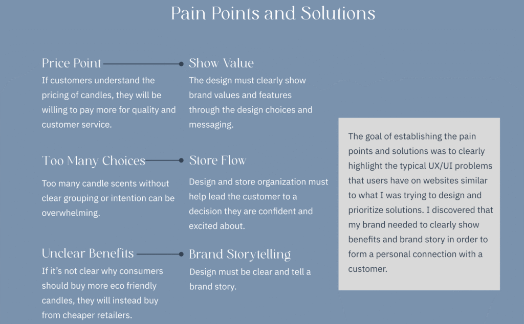
My assignment was to create a website showcasing their products and mission and to create a clear and easy-to-navigate user journey through the website.
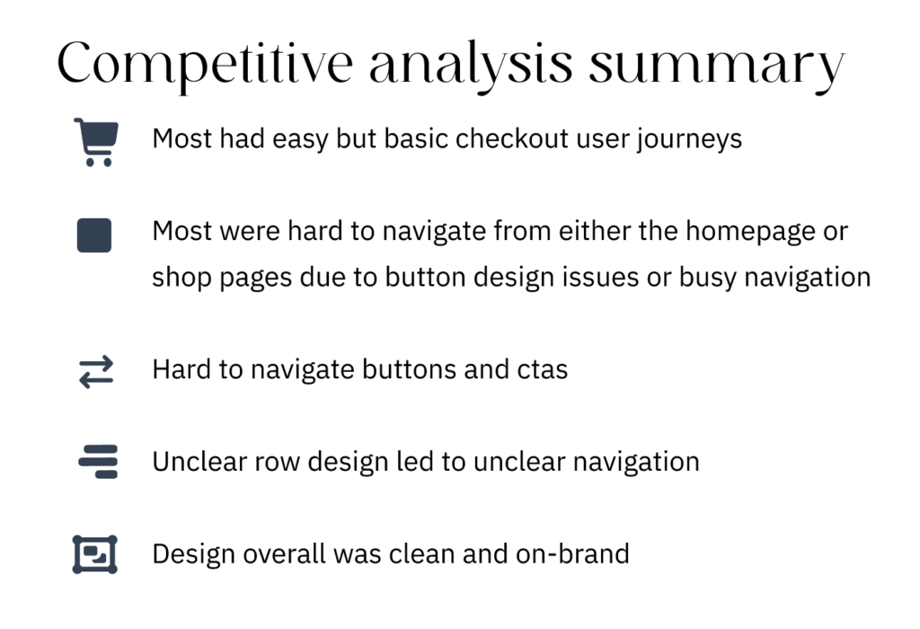
I first did a competitive analysis of three other websites and their design and user experiences. The goal of the competitive analysis phase was to show strengths and weaknesses in three similar companies. The analysis showed that the compared companies generally established branding well on their website but struggled with clear user flow and accessibility. These are things I prioritized in my user experience development process.
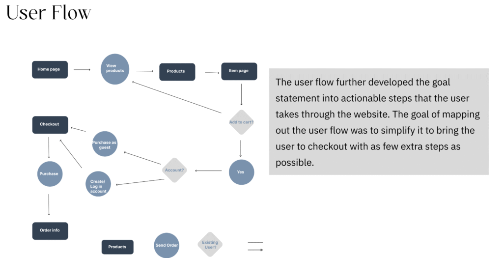
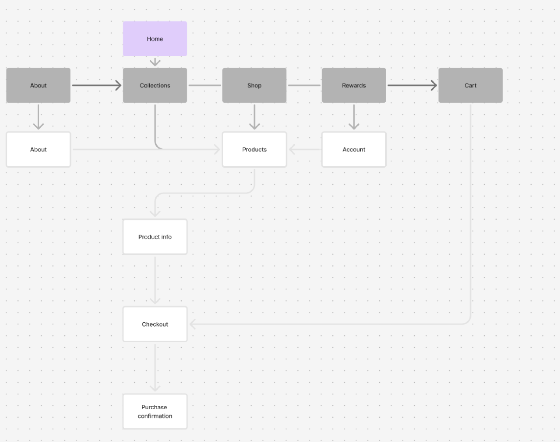
The site map stage maps out website content into pages to facilitate the user flow previously established. It helped me simplify the navigation down before wireframing.
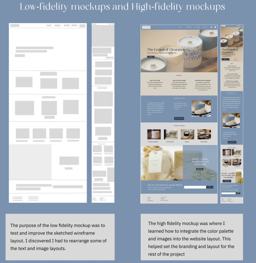
The low and high fidelity mockups were the final wireframe design steps before the prototype. This is where I tested and adjusted my layouts for both desktop and mobile, and integrated the color and typography systems.
Additional Pages
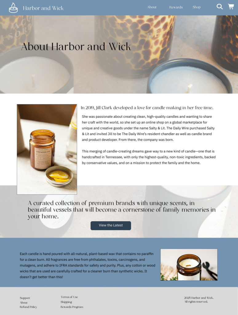
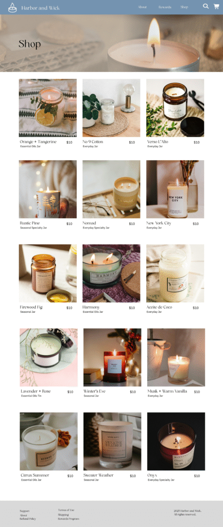
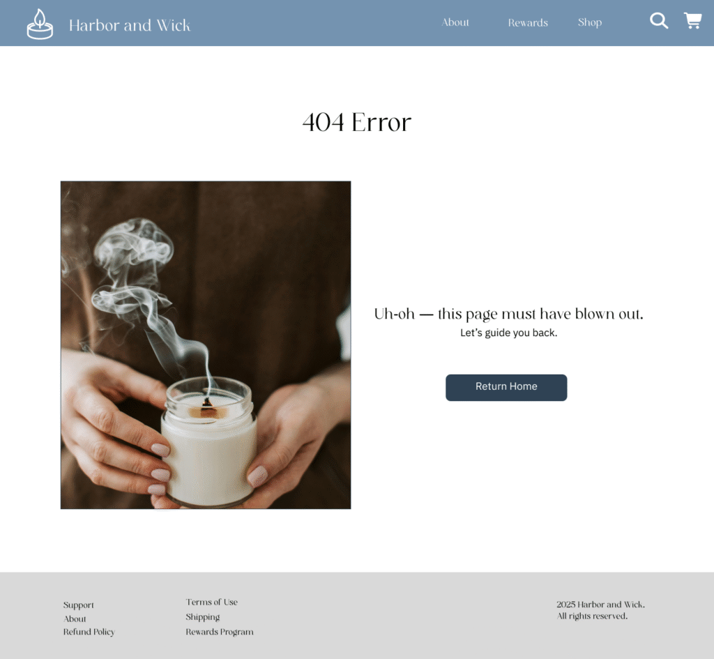
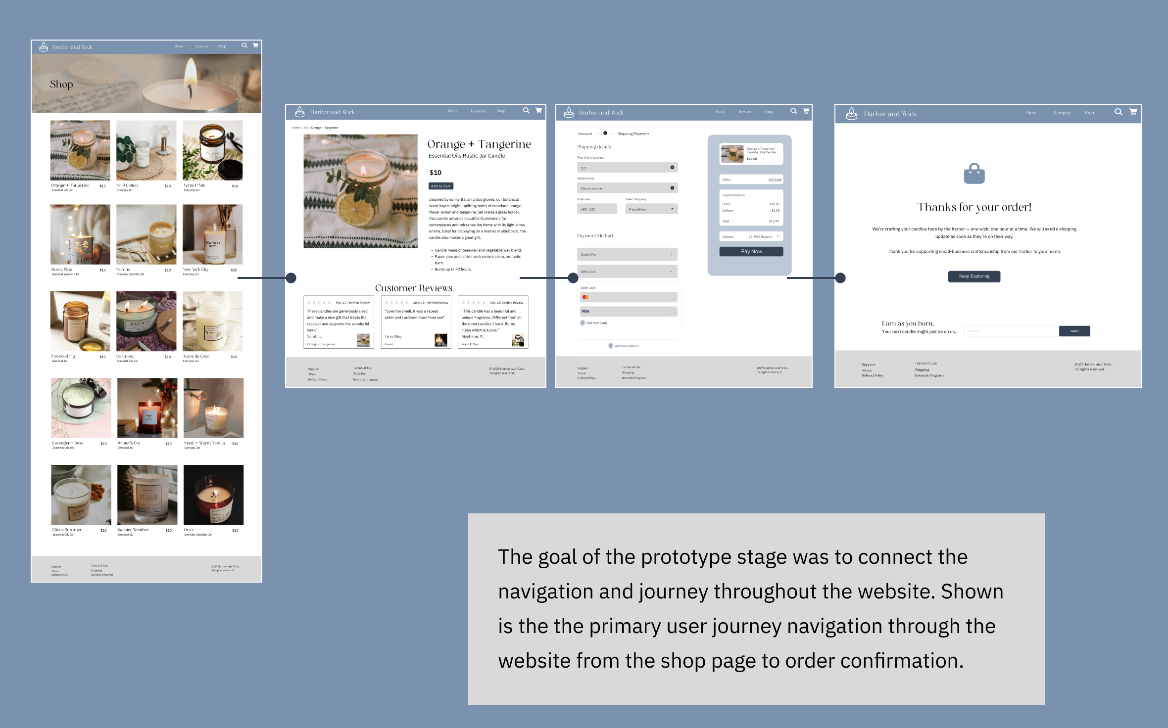
I prioritized the user journey from homepage to checkout. Additional pages were added for the user flow through the shop and product pages, as well as log-in, 404 error pages, and confirmation pages for a clear user experience.
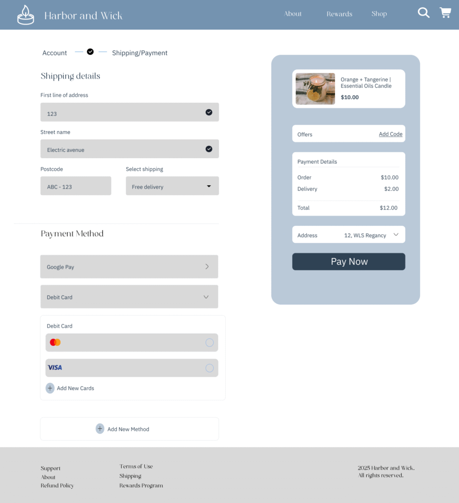
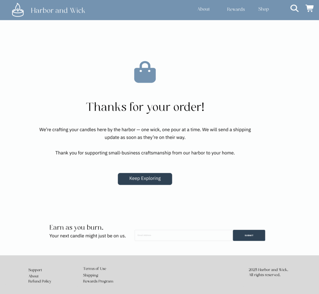
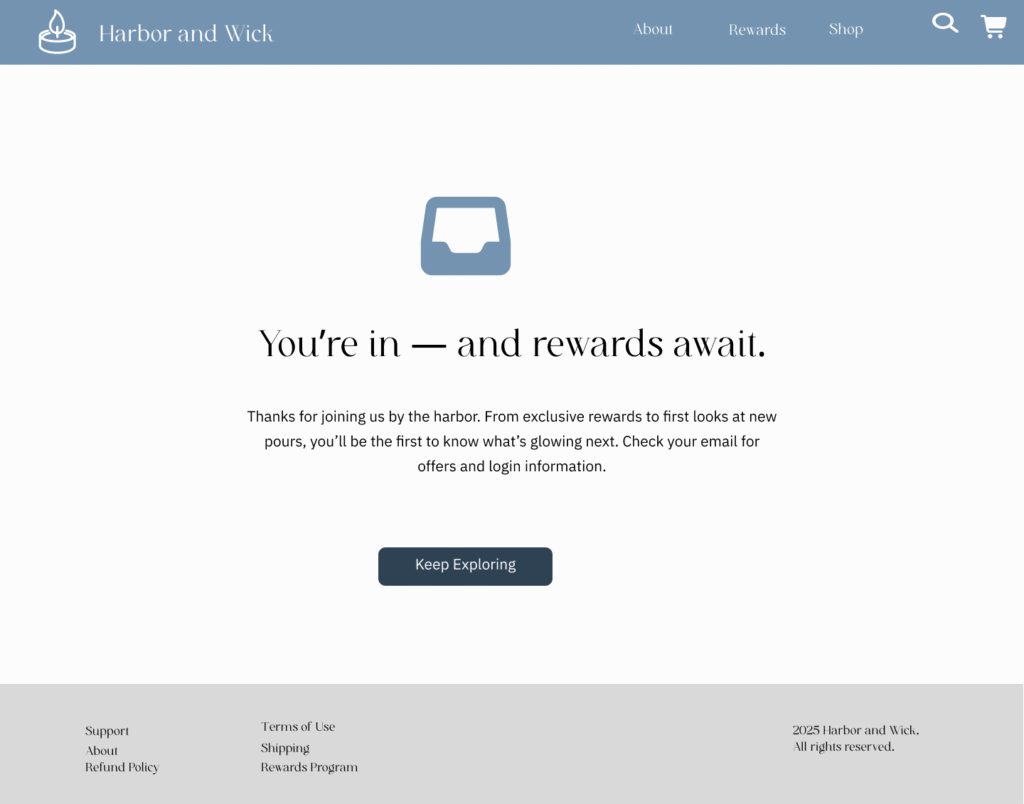
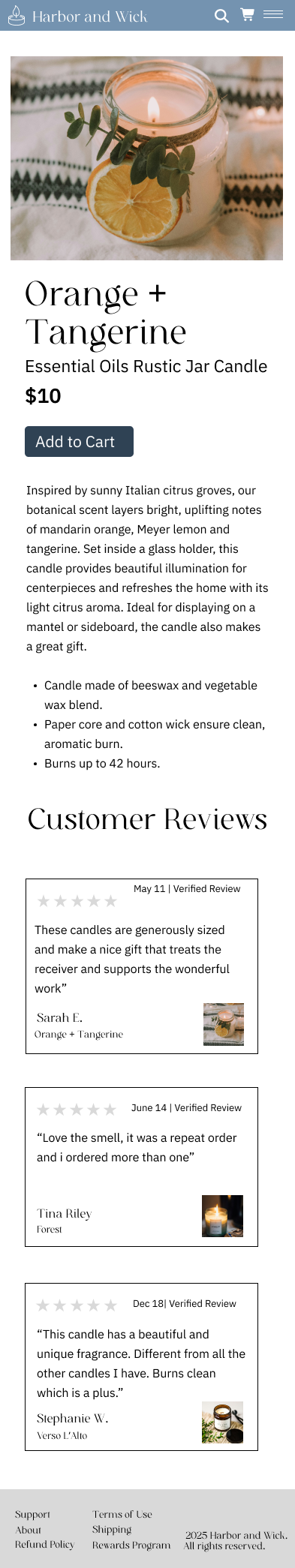
Prototype Example
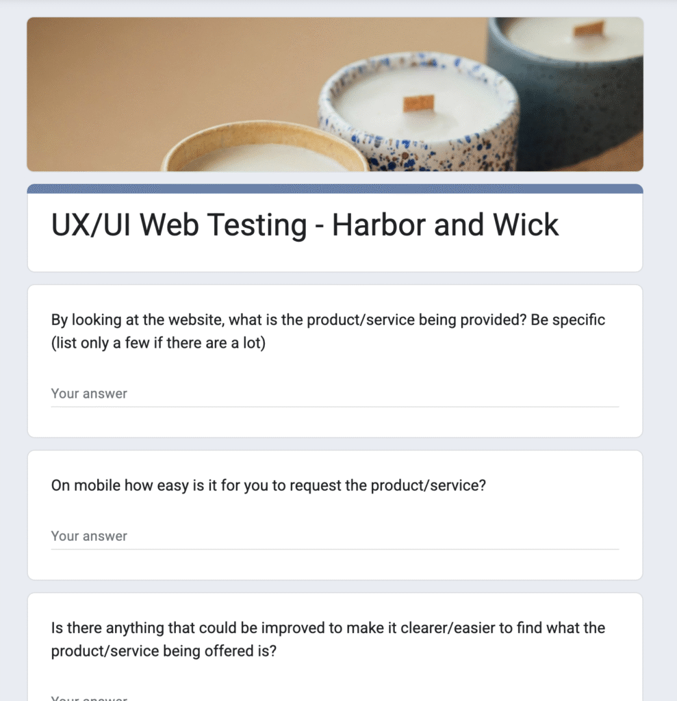
User Testing
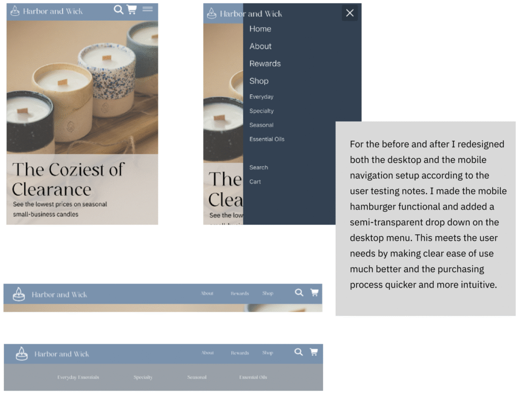
Through user testing I learned that users had trouble finding categories and returning to the homepage from some pages. The hamburger menu on mobile also needed to be improved.
App Design