Design Showcase – The Wilting Rose Project
Design Showcase
The Wilting Rose Project
Branding and concept designs from my time with a Christian young women’s ministry,
Project Scope
I served as Head Graphic Designer of The Wilting Rose Project for over two years. I took the current branding and design style and completely overhauled it to better fit the target market and brand aesthetic we were leaning into. Here’s some of the things I created for them!
Services
Instagram Design
PDF Design
Newsletter Concept Design
Web Graphics (Blog Post Headers)
See the Instagram puzzle feed in action.
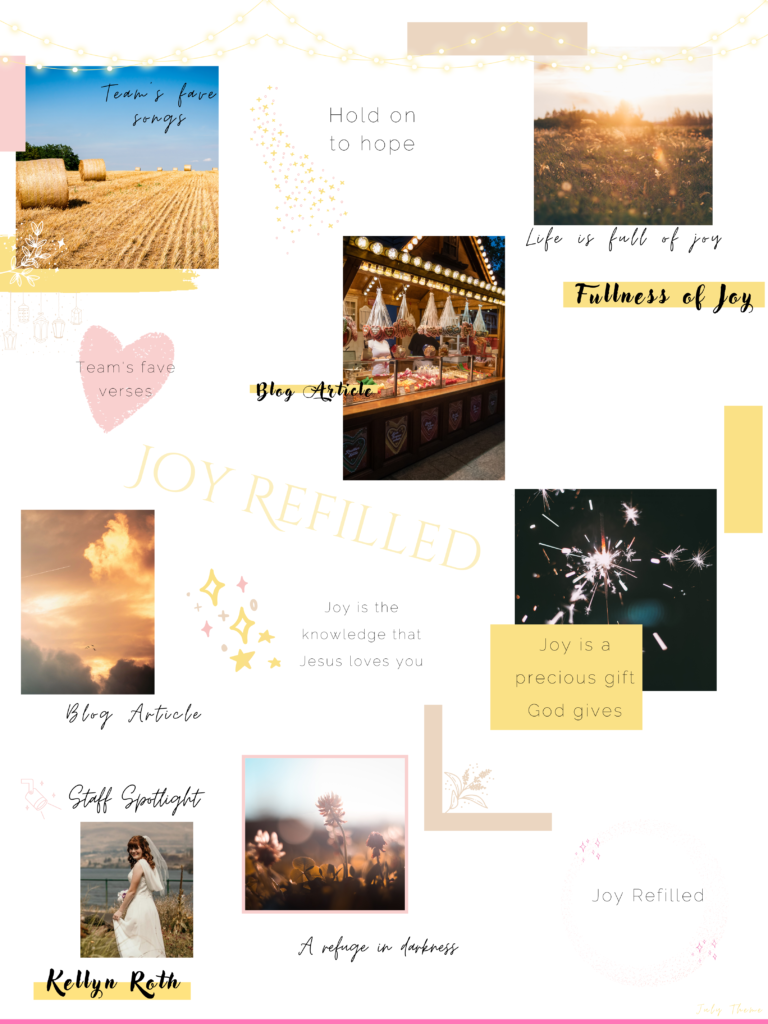
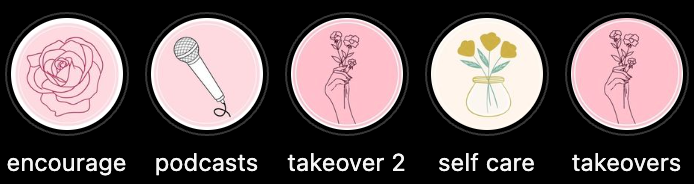
Instagram Puzzle Design
When I first started with TWRP, we were using a alternating checkerboard design using muted browns and pinks. While this color scheme worked, it didn’t fit our target audience at all nor did it fit with our brand values and branding. We needed something that emphasized the youthful pink colors of our brand as well as was minimalistic and up-to-date to appeal to our ideal audience of young women. I decided to try what was trending at the time (2022) and try a puzzle design with our current colors. It really emphasized our imagery as well as brought in a lot of white and clean lines which helped to contrast and offset the old feed design. We’ve been using this design since then, changing out one color every month for seasonal change while keeping the other brand colors consistent.
Highlight Covers
I updated the highlight covers with our new colors and brought it more line art as well to make it cohesive with the new design.
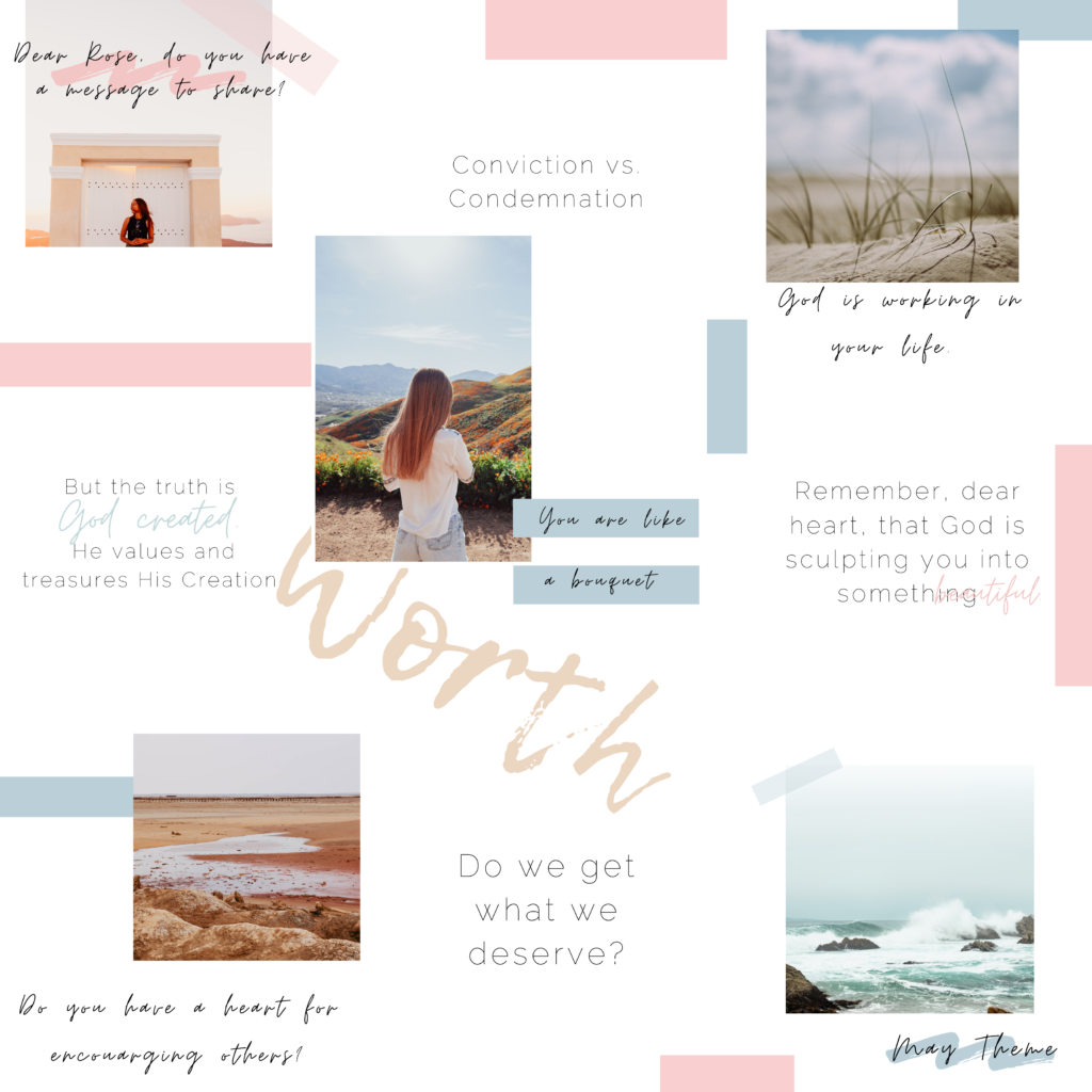
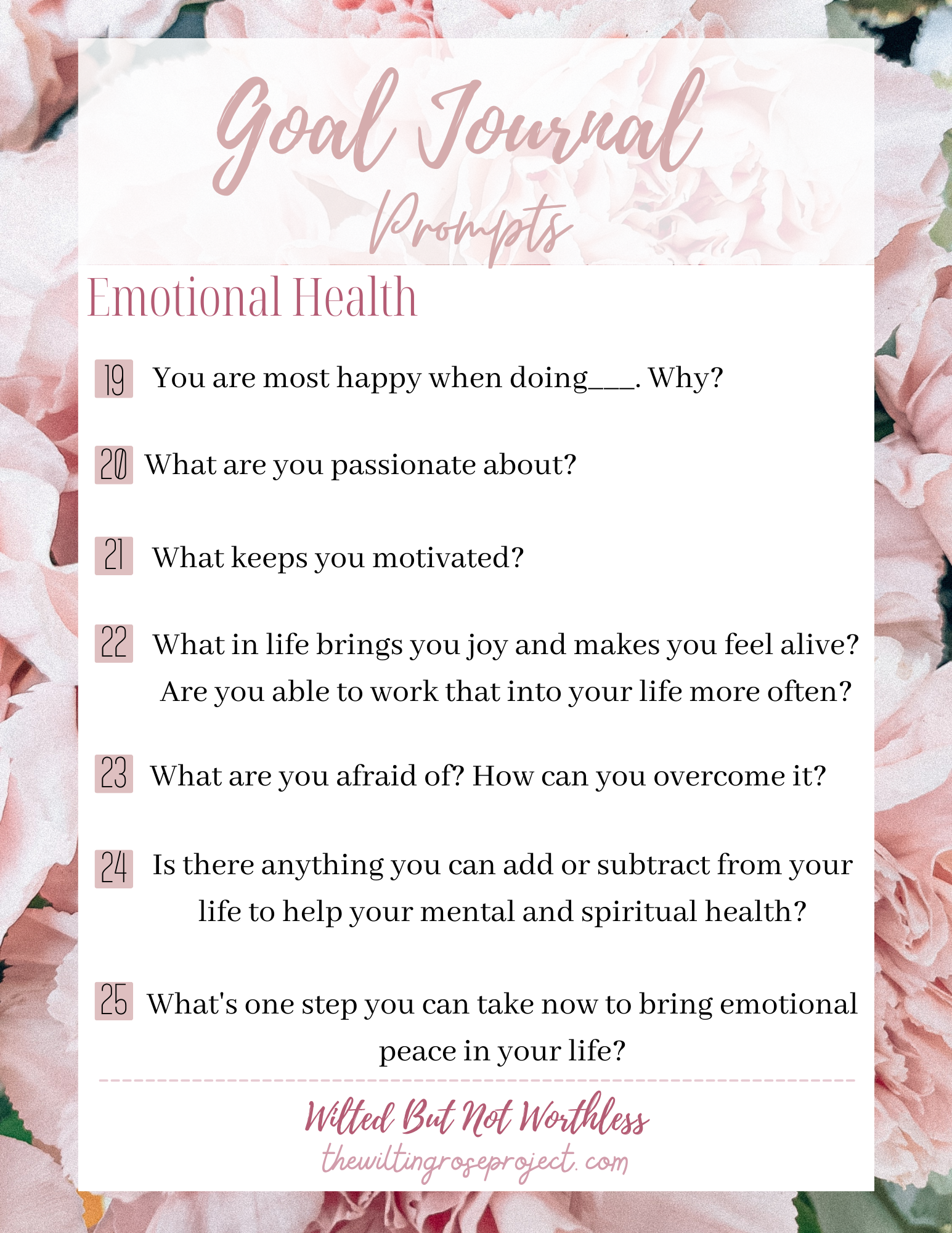
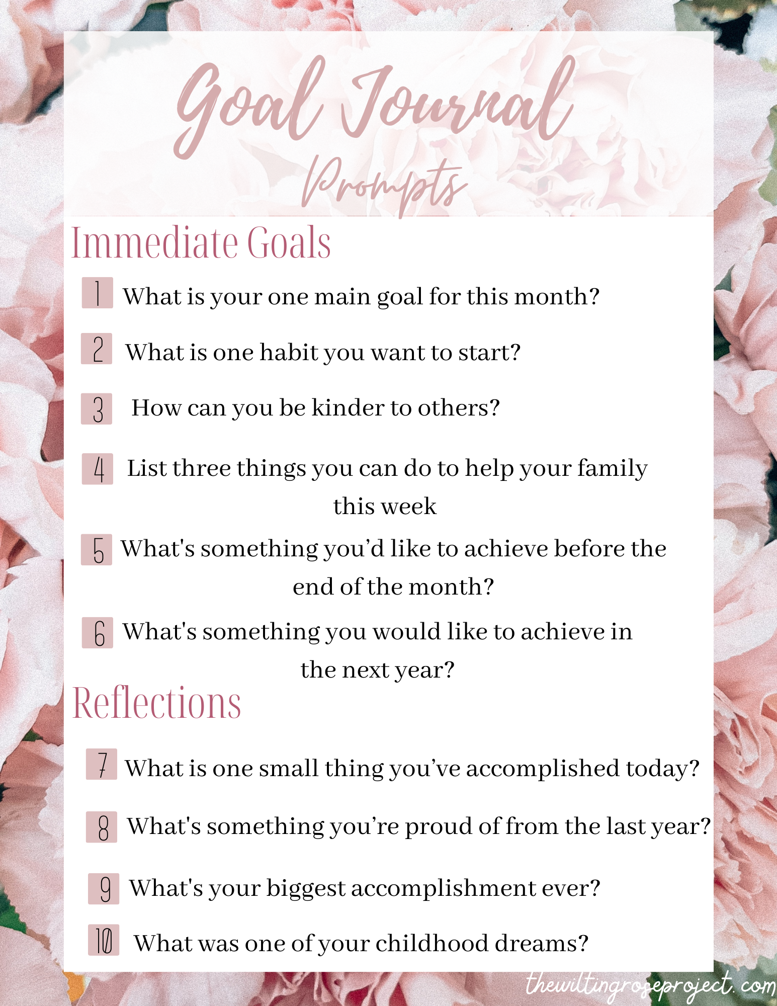
PDF Design
We needed to have a free download for our Instagram subscribers for a month’s content theme. I was given the theme and then created this PDF freebie off of that. I wanted to keep it simple and readable, while staying very on-brand, since this was something that would be getting downloaded and potentially shared. I used a lot more of the logo script font than I typically do.
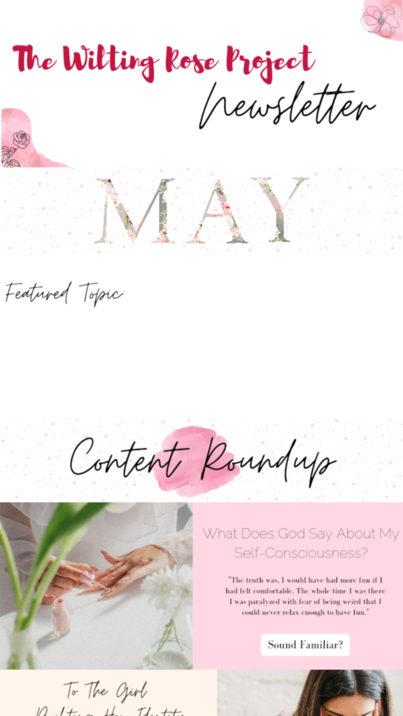
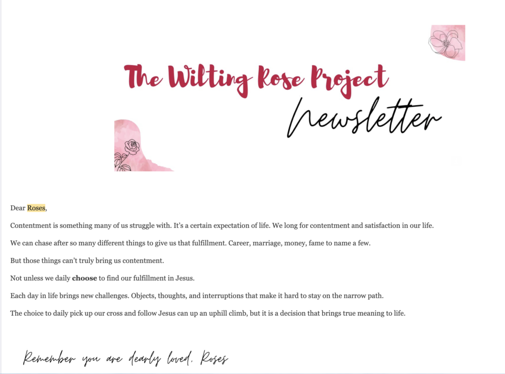
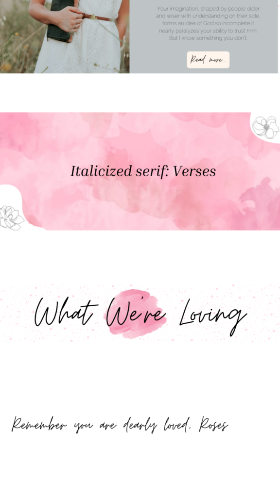
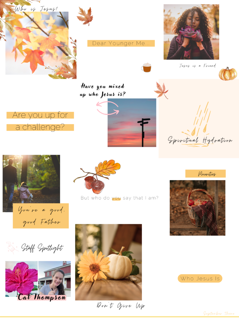
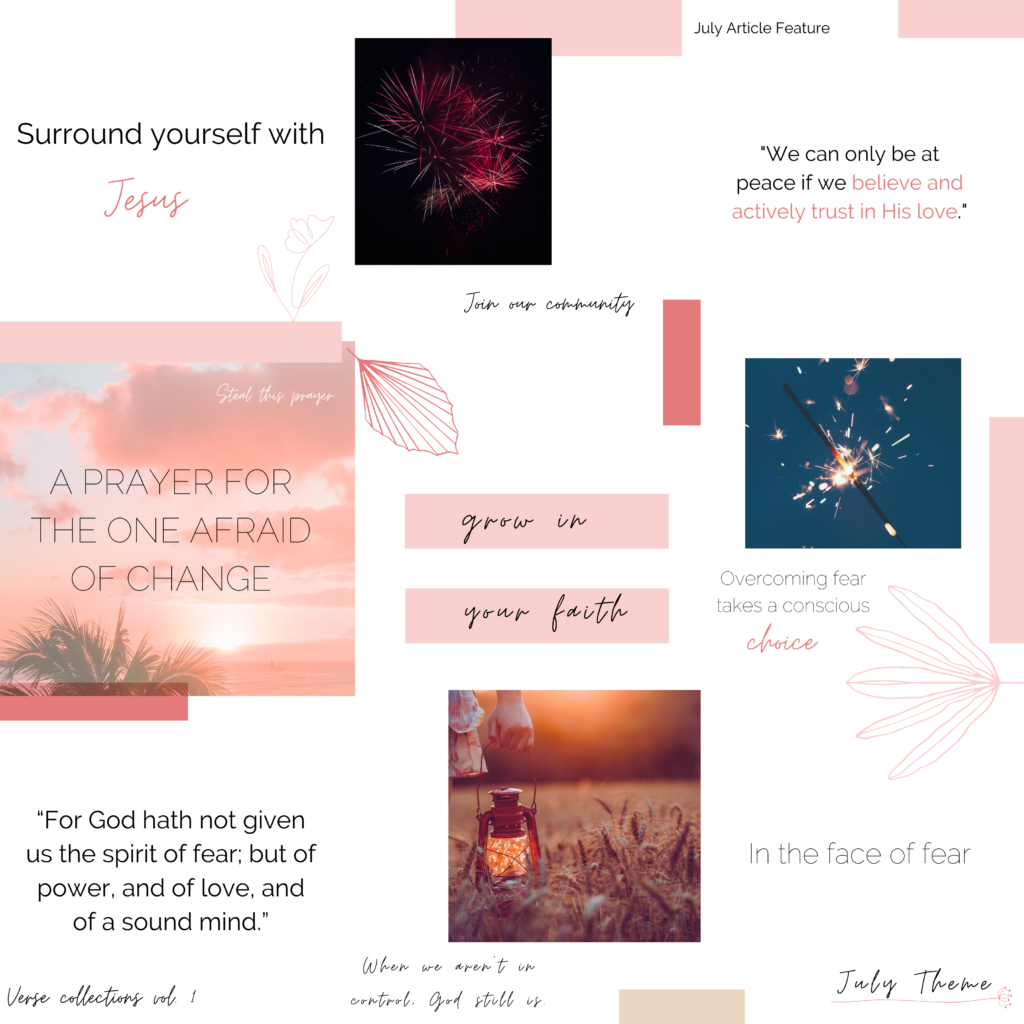
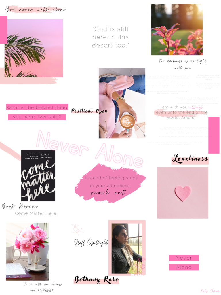
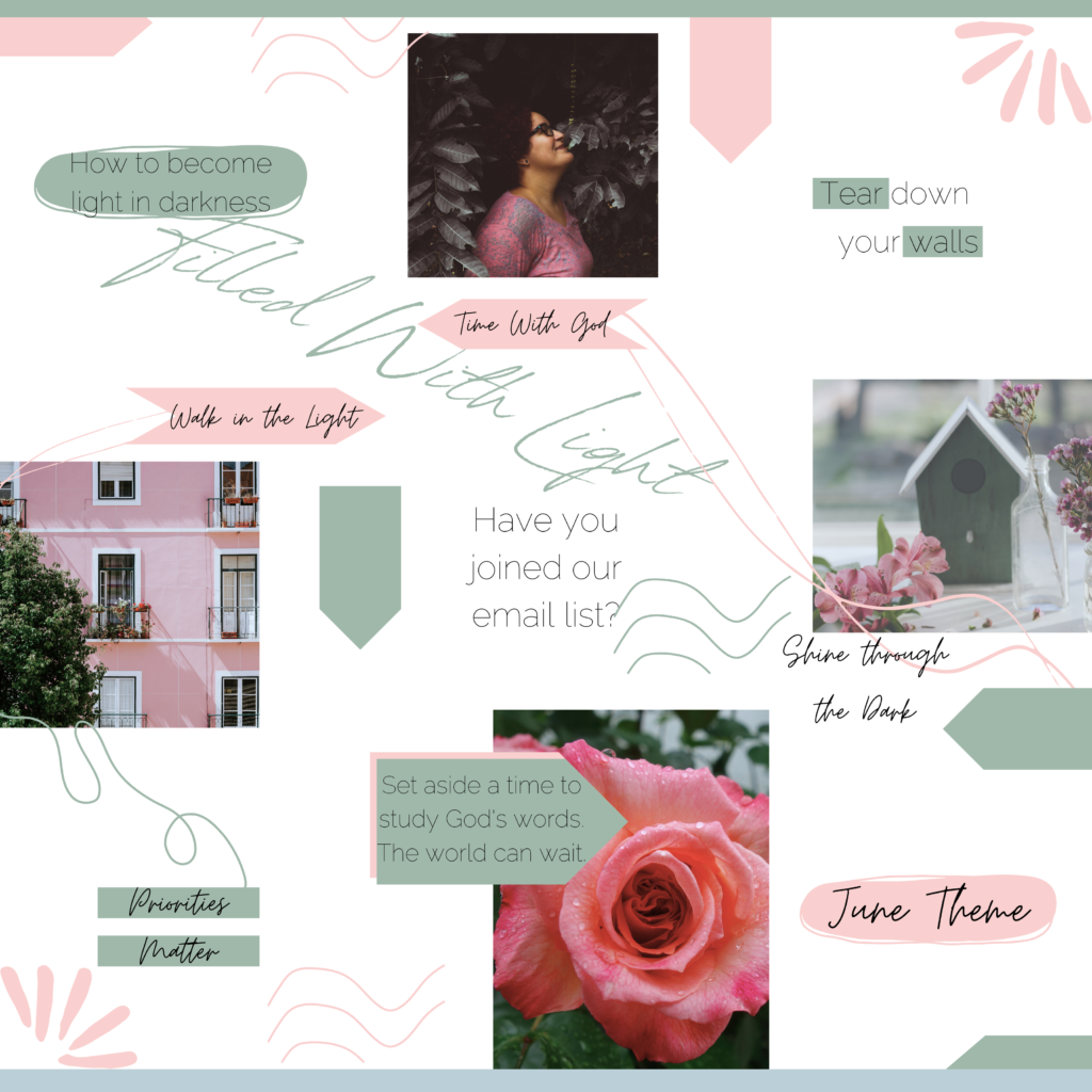
Newsletter concept design
The newsletter redesign was ambitious, and since then the newsletter has gotten much more streamlined as shown in the third slide. But the newsletter really needed an aesthetic refresh as well as a boost in readability and content organization.
I chose to highlight the brand fonts alongside watercolor elements. We also designed blog promos that include an image related to the article and a color shift to match that.
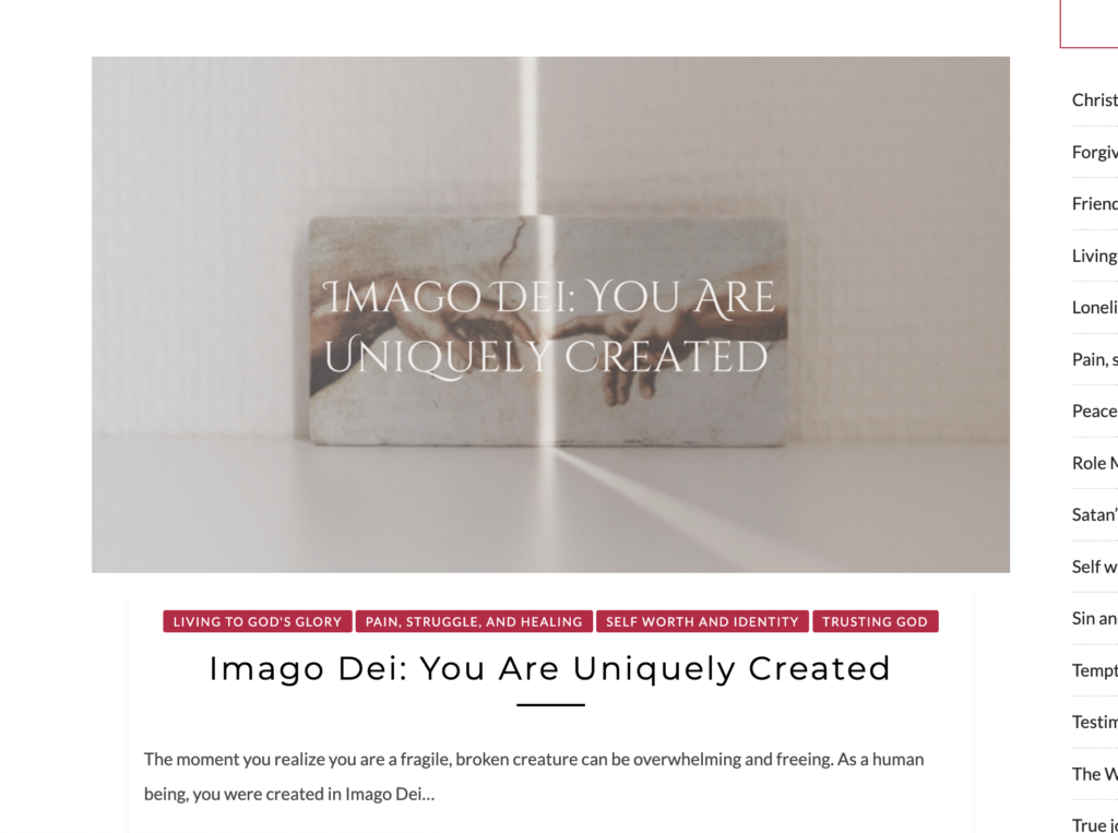
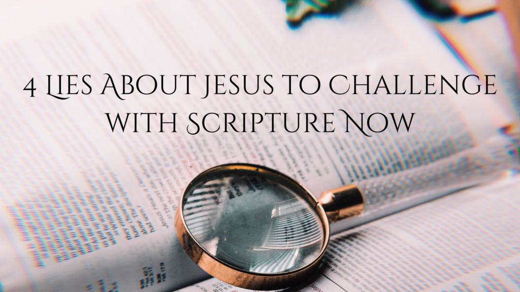
Blog Headers
The blog headers were a new design concept I brought in as well. Because the headers take up the predominant amount of the page when posted, I wanted to bring in the article name and design that to work with the image behind.
It’s not always the easiest design challenge to solve. But it does really help tie things together on the website!

Results
“Cat’s designs are impactful, intelligent, and visually interesting.”
“She’s so easy to work with and always tackles each project with enthusiasm. If you’re looking for a graphic designer who will put in the work to understand you and your brand goals and produce stunning designs, I highly recommend working with her!”