Design Showcase
Bay State Coffee Co. Package Concept
Concept packaging for Bay State Coffee Co — a fair-trade coffee brand rooted in New England tradition and flavors. This was created as part of a class assignment for Graphic Design II.
Project Scope
This project involved developing packaging design for Bay State Coffee Co., a conceptual fair-trade coffee brand based in Boston. The scope included designing product packaging reflecting the brand’s local New England roots, and design individual K-cup flavor packaging. The design and flavors were inspired by Boston neighborhoods, pairing warm color palettes and textured typography to create an authentic, community-driven identity.
Scope
Brand Expansion
Package Design
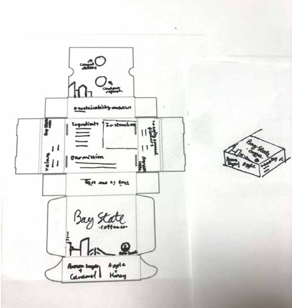
Initial packaging concept sketches
Brand Industry and Content
Bay State Coffee Co is a Boston-inspired specialty coffee brand designed for health-conscious, community-minded adults seeking sustainable and locally rooted options. The brand stands out in a corporate-dominated market through authentic storytelling, regional flavor, and artisanal values.
Client Vision
The goal was to craft a modern, approachable packaging system that reflects Bay State Coffee Co’s local pride and high-end craft. The design connects with busy professionals through bold visuals, clear messaging, and a sense of New England.
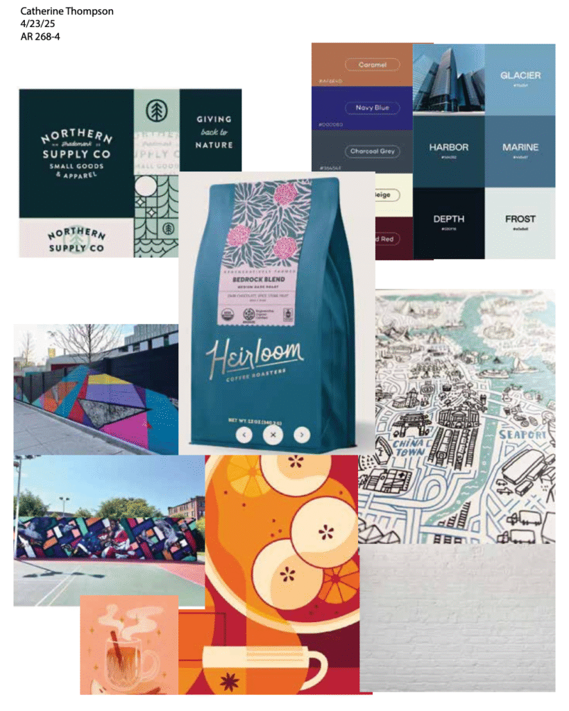
I first created a moodboard with both illustrations and photos. This set a direction for what I wanted my style and illustrations to look like.
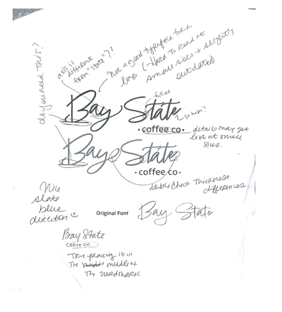
This was the first wordmark I created for the logo along with the teacher notes.
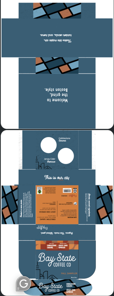
Packaging thumbnail sketch using the box design I created using a similar box found in real life and then converted to a flat format for designing.
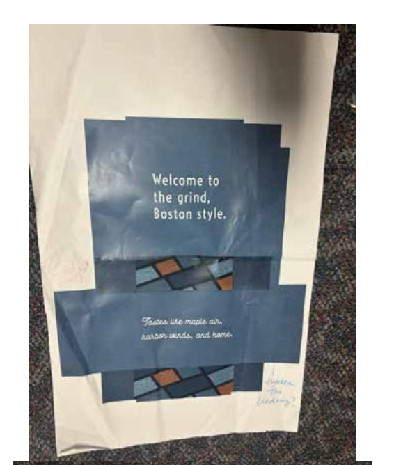
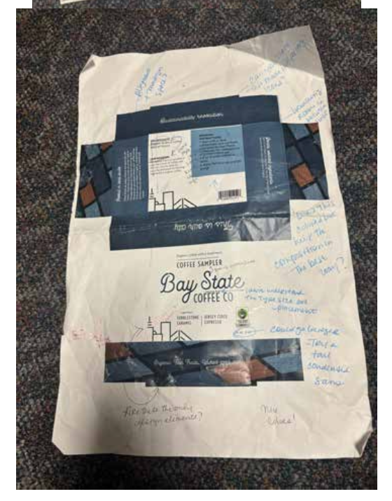
These are the two print tests to see the color and design. The original package design included a white top and bottom. Also included are the teachers notes.
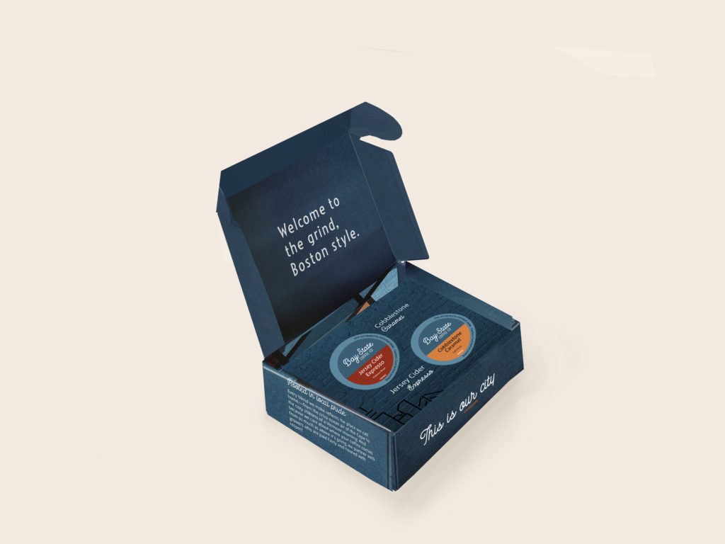
Final Design
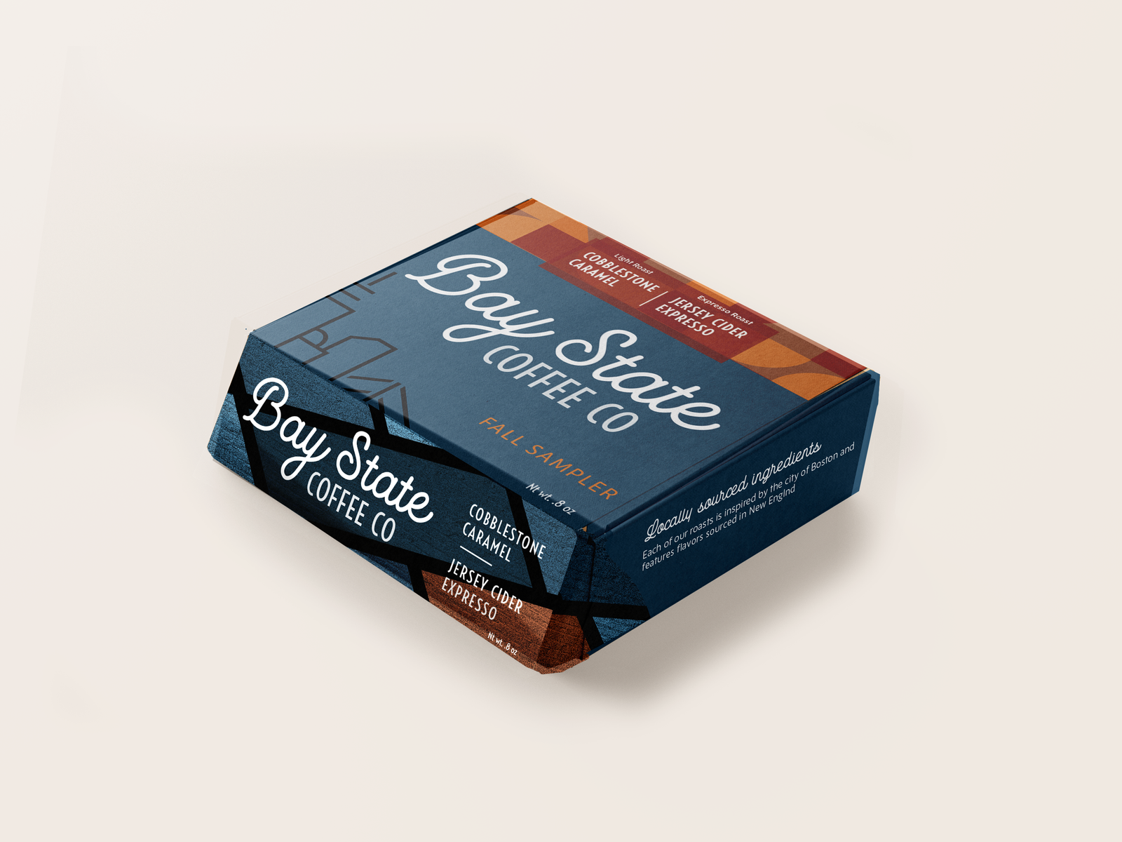

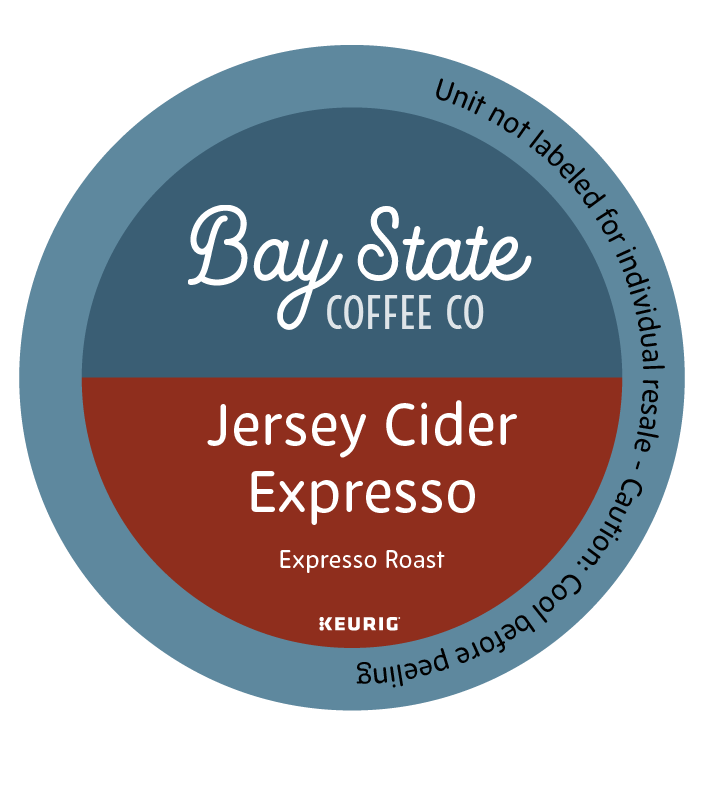
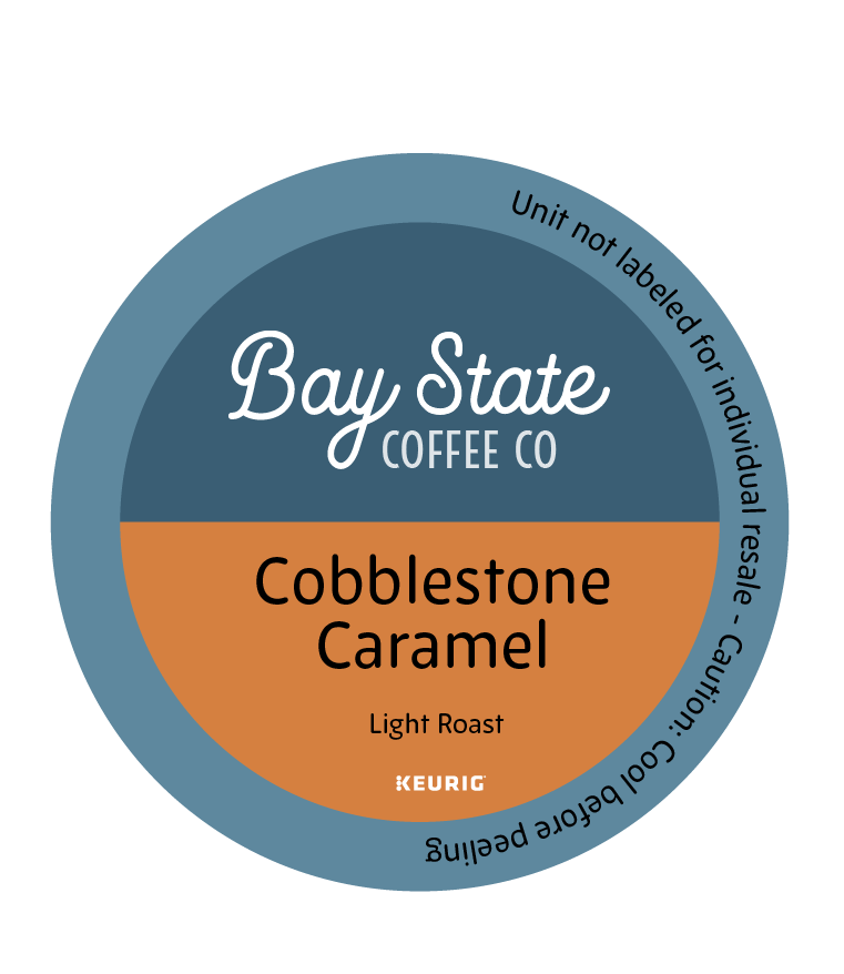
Full design layout and K-cups design