Client Spotlight – Wild Blue Wonder Press
Client Spotlight
Wild Blue Wonder Press
I joined with a publishing press for the first six months of their launch. Here’s the custom Instagram process and look.
Project Scope
I joined with Wild Blue Wonder Press as their Instagram Strategist and Designer for 6 months to help get the small press launched and the first anthology announced
Services
Custom Launch Package
Instagram Design
Instagram Strategy
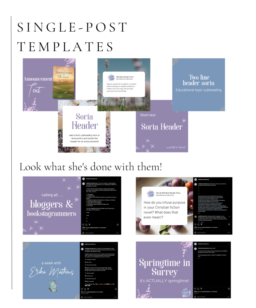
Instagram Post Templates
Project Goals
To launch Wild Blue Wonder press, provide custom design services as well as strategy guidance, then to transfer over design themes using Canva templates.
Project Design Overview
The head of Wild Blue Wonder Press brought me on the team to help launch and establish the brand. They already had a website and branding elements in place, but the owner didn’t have the time or resources for the necessary Instagram marketing. The project scope was varied, but my main goal was establishing what the company valued and represented through the design choices and posting strategy. The Instagram strategy case study is still in progress: however, read my individual notes on each part of the design process below 👇

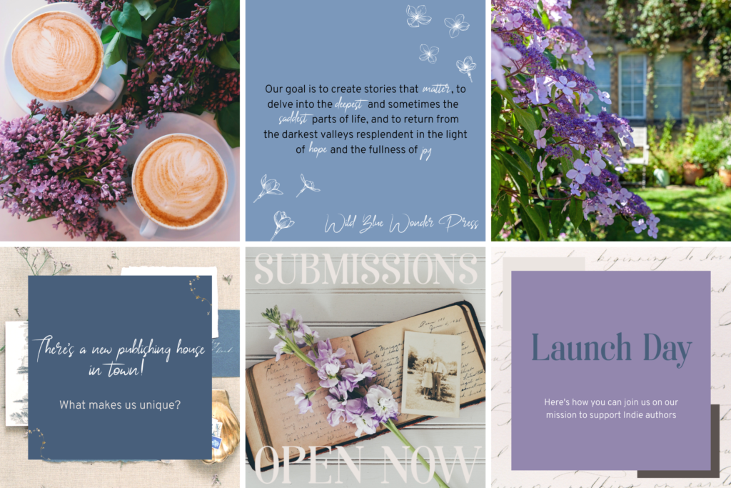
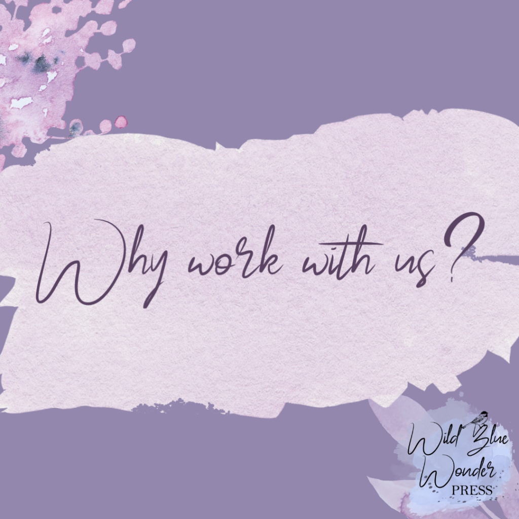
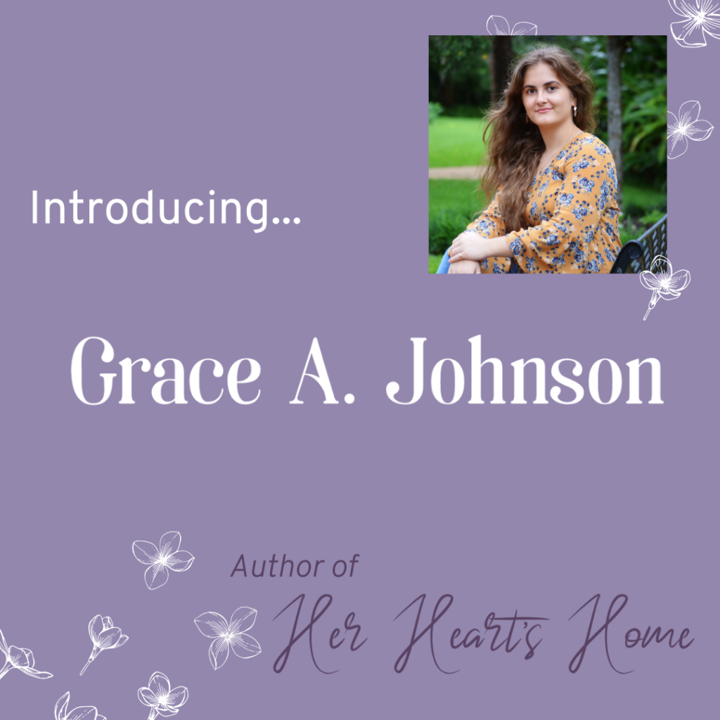
The posts and images created during the custom post design process
Client Industry and Content
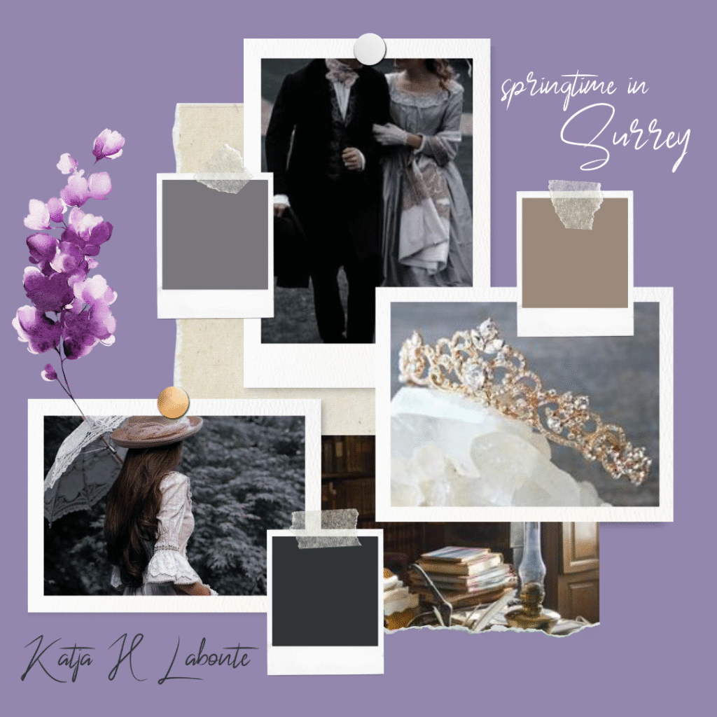
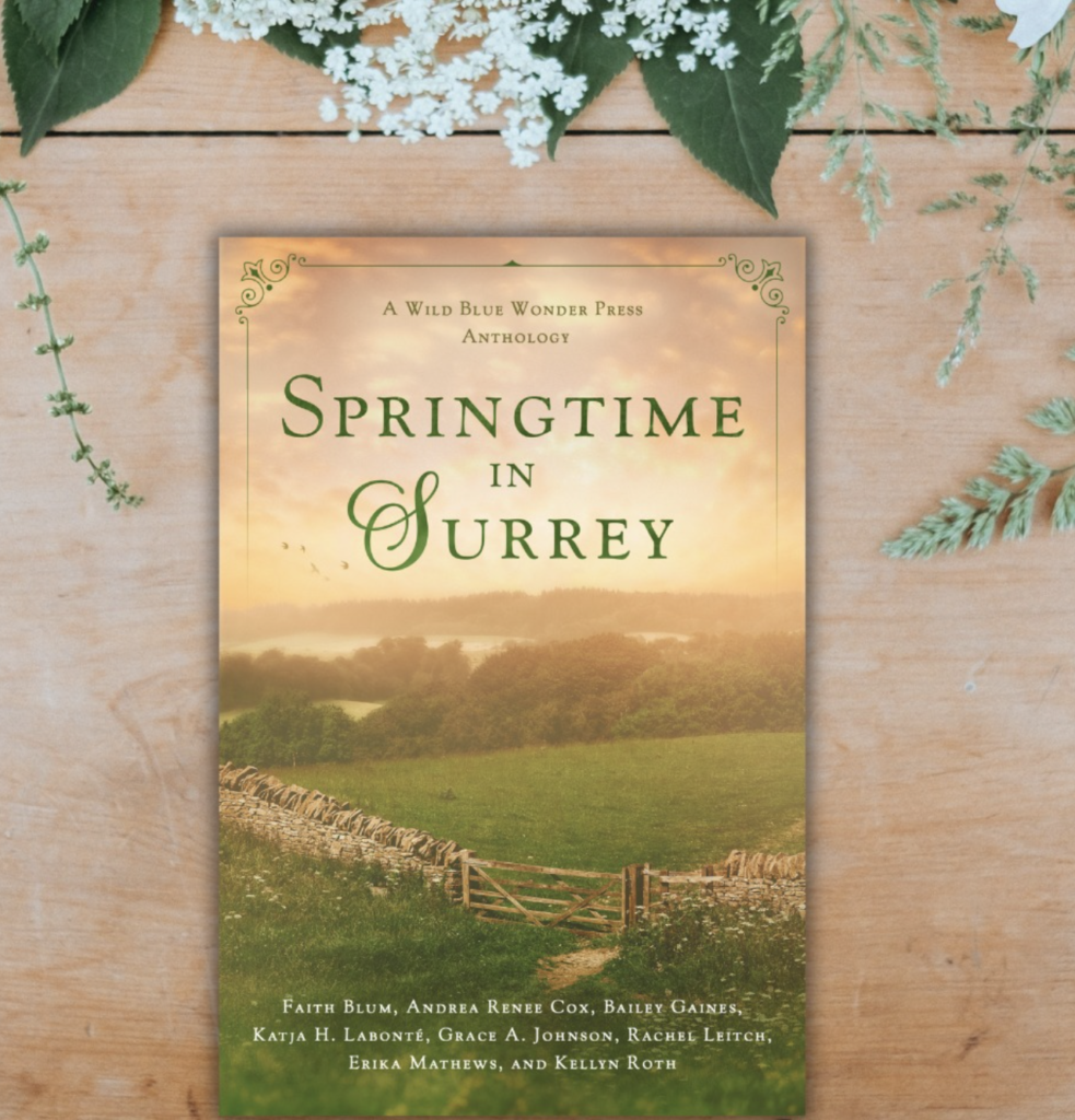
“We are a team of Christian creators determined to create God-honoring fiction that matters. Wild Blue Wonder Press’s mission is to share fictional stories full of grace and truth. Our goal is to create stories that matter, to delve into the deepest and sometimes the saddest parts of life, and to return from the darkest valleys resplendent in the light of hope and the fullness of joy.” To visually represent this and to promote the visuals of the press’s first anthology, Springtime in Surrey, I incorporated a lot of hopeful floral elements as well as whimsical and thoughtful imagery.
Client Vision
The Client’s goal for this project was to get cohesive design and content ideas for posts that would be helpful for her audience.
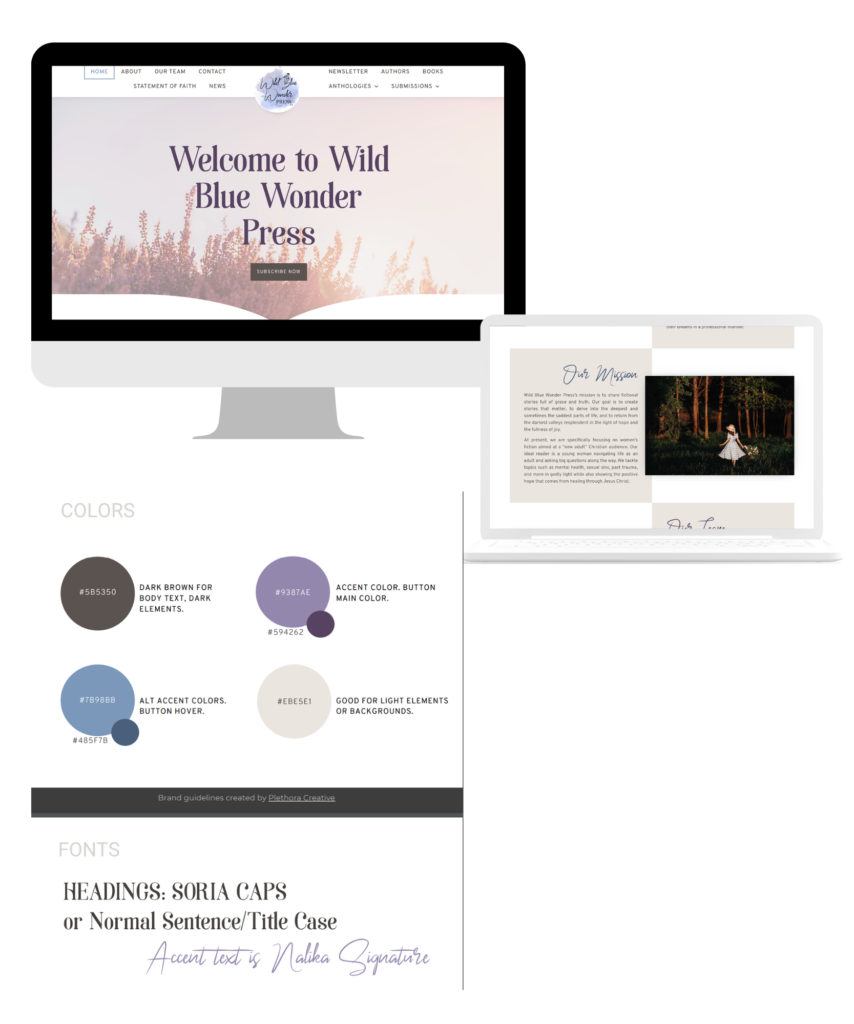
I was given by the client a well organized branding kit written by www.plethoracreative.com as well as the website to aid in branding aesthetic. This was the foundation for everything else created.
For launch day graphics I used extra typography elements to establish the brand fonts, since text hadn’t been included in most of the previous post graphics. I also started experimenting with layout of the individual posts, while starting to build the checkerboard IG feed style she wanted.
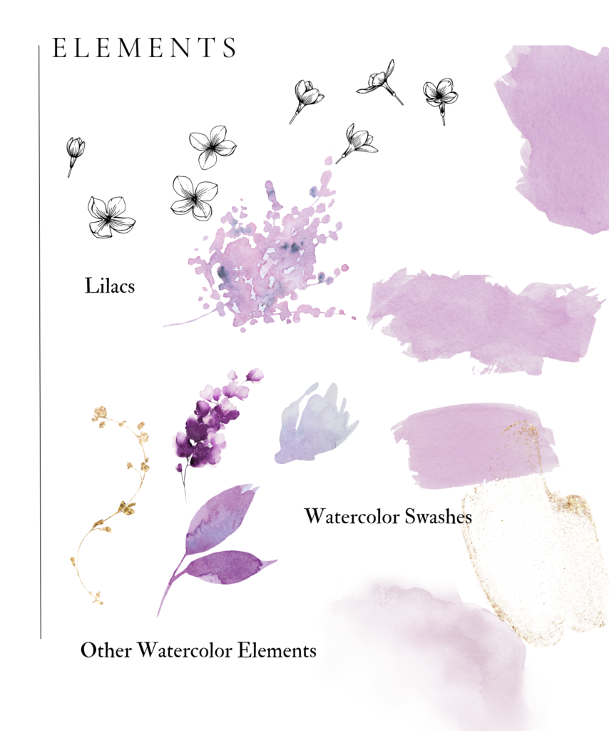
For elements, we incorporated watercolor swashes to tie in the watercolor theme from the Wild Blue Wonder Press Logo. We also brought in lilacs and more floral watercolor elements as well as lilac floral line art. This gave us the most brand coherence as well as flexibility in how to use the elements.
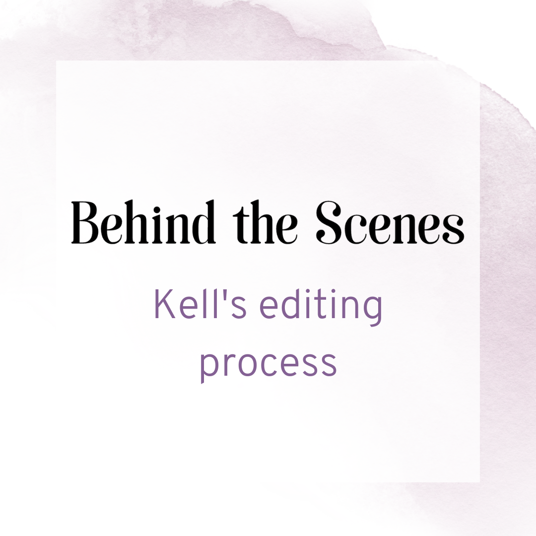
Team Spotlights
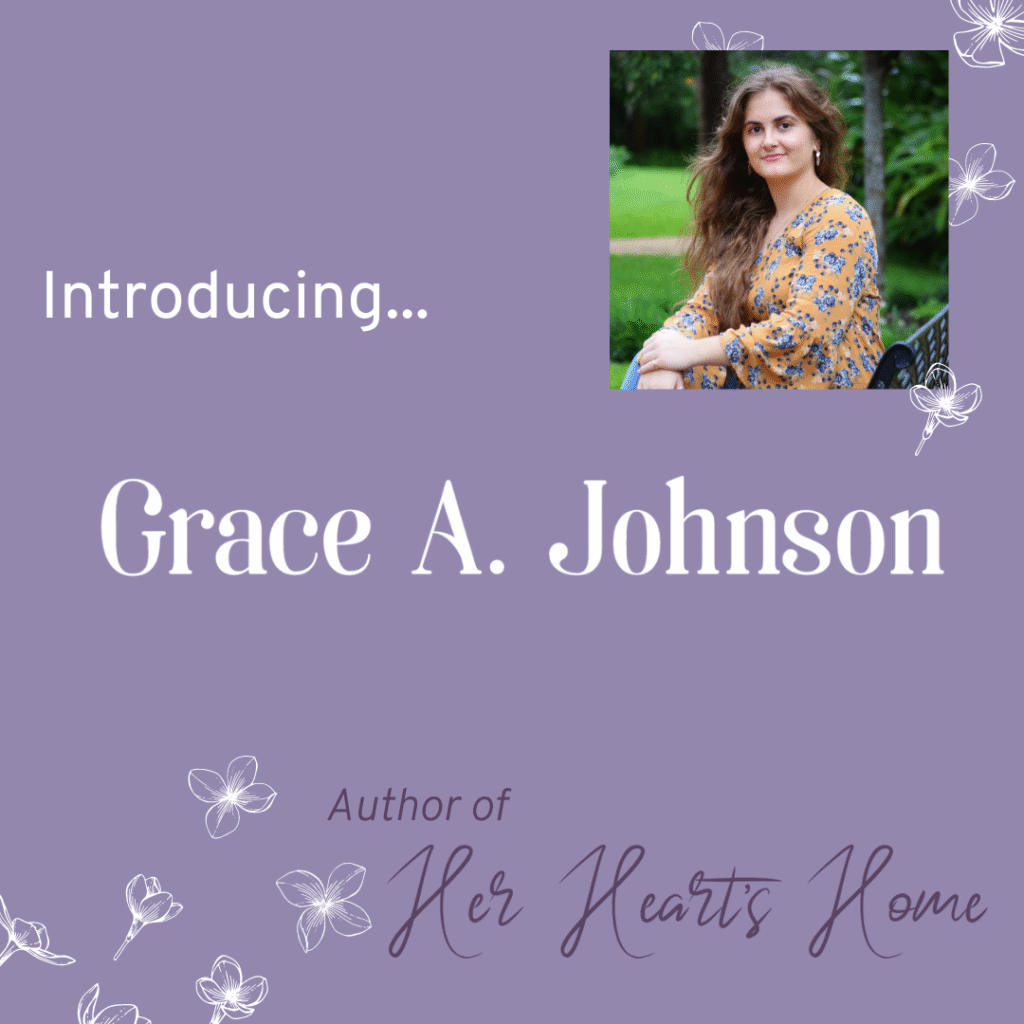
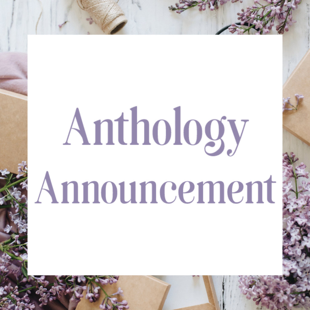
Anthology content announcement
Story Mood Board for Announcement post


When it got time to create templates I chose to balance staying as close to the current design layouts as possible while making them easier to edit quickly. Some of the backgrounds can be used as static backgrounds for different types of posts, and that’s what she’s chosen to do with many of them.

Results
“we are so thankful to have her as a vital part of the team!”
If you’ve been enjoying the gorgeous aesthetic and graphics of Wild Blue Wonder Press on our socials, we have Cat to thank for that! (Did I mean to rhyme? Possibly.)
She put together so many of the graphics and made it look so pretty and neat!