Design Showcase – The Scarlet Thread Branding
Design Showcase
The Scarlet Thread Branding
Using embroidery inspiration and content messaging to build a brand identity for a fall women’s retreat
Adobe Illustrator • Canva
Project Scope
Services
Event Branding
Slide Deck Templates
Booklet Cover Design
Project Goals
To create cohesive branding for The Scarlet Thread retreat event, by creating a logo and brand identity and event collateral (slides and booklet).
Project Design Overview
The message of this event was the redemption of shame through the thread of God’s grace. Jen Headlee, my internship supervisor and the head of the women’s retreat marketing, wanted to show this content message through the branding and inspiration she had found for event decoration. Read my individual notes on each part of the process below 👇
This project was created as part of my media internship for Camp Monadnock during summer 2025.
Client Industry and Content
Camp Monadnock is a Christian camp organization that runs both summer camps and adult retreat events. The women’s retreat is “A place for women to disconnect from daily life and reconnect to God and each other.”
Client Vision
Jen’s goal for this project was to get branding pieces in place that her internal marketing team could build off and customize for their event materials.
Colors
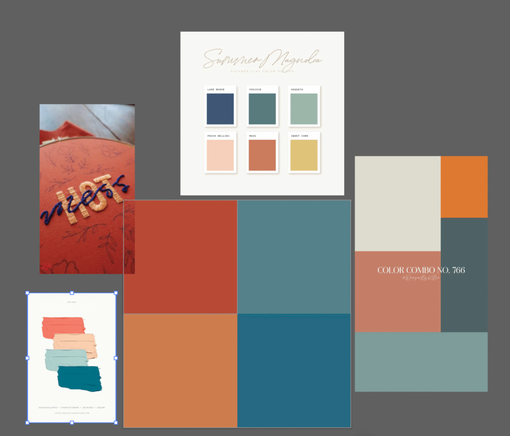
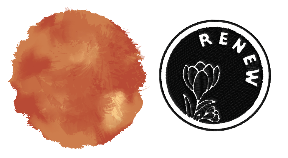
Jen had some color suggestions and a general design aesthetic in mind. She wanted to incorporate reds and blues together to show the interplay of shame and grace through color theory. The photos I was shown was the “hot mess” embroidery photo on the left of the color palette block. I found some other color inspiration in the photos around the edges, then created a color palette based on the inspiration photo for the colors to blend better together and have appropriate contrast and saturation together. The red, orange, and blue color block shown in the center of this screenshot is the final color palette.
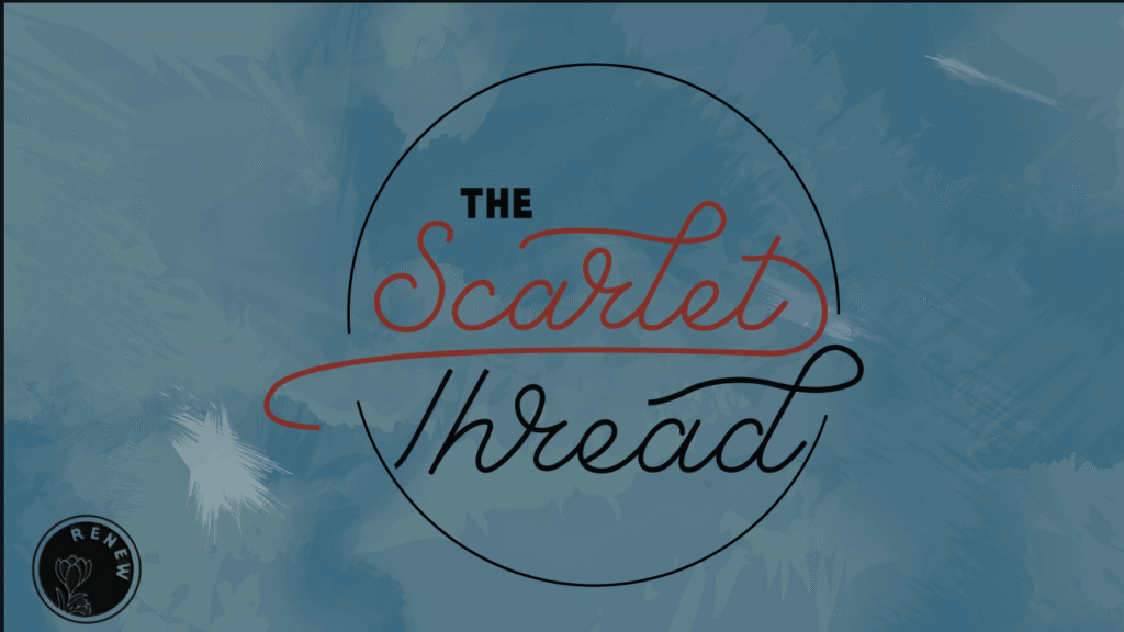
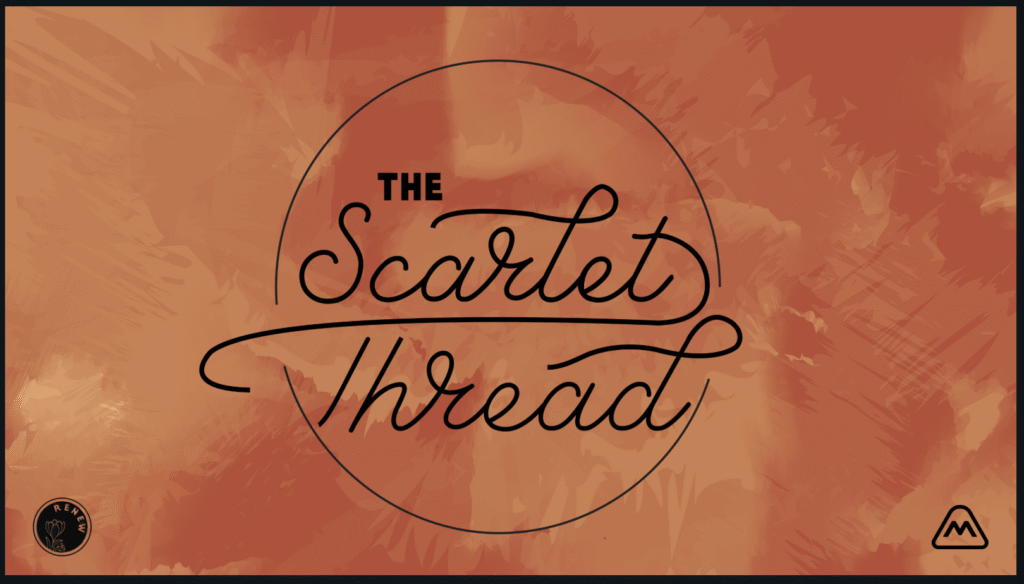
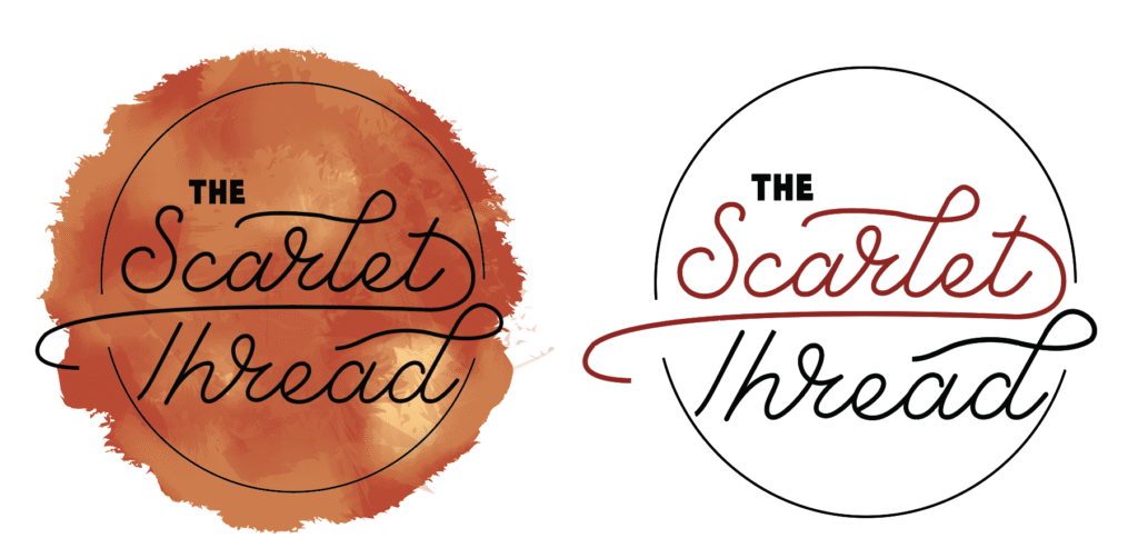
Logo Variations
The two main logo variations delivered were a single color logo (created in black, but delivered as a vector for customizability) and a black logo with the red text. The block text is based off the Camp Monadnock branding and the script text was edited to look more like the embroidery inspiration.

Elements
As far as elements, I knew from another project with Kellyn that she liked watercolor elements. From her request for a “cottagecore” and “feminine” vibe, along with her brand Pinterest board, we incorporated wildflowers into her elements and photography collections. I also incorporated some vintage elements and cabin and forest mountains clip art, to really bring her rustic cabin aesthetic to life and pair that with things that reflect her historical fiction genre.
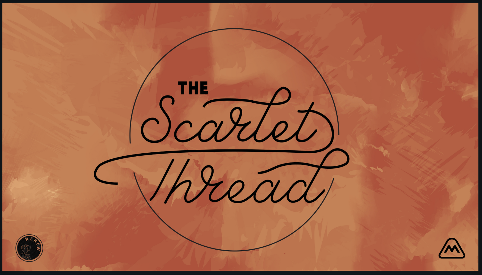
Slide Deck
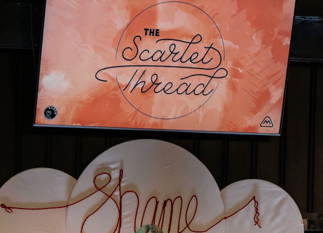
The event mainly uses branding on the chapel screens, since their social media presence is so photography based. I created some title screens and template backgrounds based on the watercolor element style used and the color palette established. The slides were all created in Canva so they would be customizable up until the day of the event, using the elements created in Illustrator.
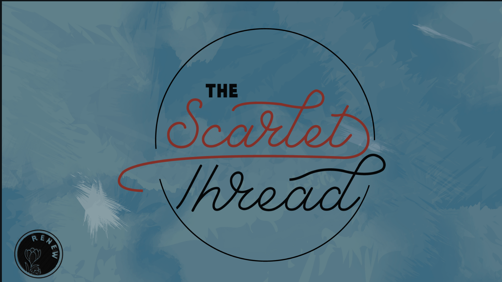
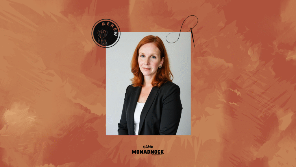
Look what they did with the template!
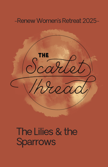
Booklet Cover
The other main event branding collateral piece was a booklet. Every attendee of the in-person event received a booklet for the program outline and personal notes. I designed a cover version for them to use for based on a previous retreat “Lilies and the Sparrows”design layout.